Welcome to our Fall 2017 Newsletter
 Summer has passed by like a storm to the point where one can wonder "what Summer"?
But do not worry, neither the vacation period nor the bad weather have prevented us from developing new graphics and continue the development of Octopus 5.
In addition, webinars have returned on September 20 to offer new content every 4 weeks.
Happy reading!
Webinars |
The Octopus webinars, always a useful tool
Although the content of the webinars is only accessible in French right now, some of you may be at ease with the language, so we wanted to let you know what was coming up.
In 45 minutes or less we usually cover a topic by explaining the options available, our recommendations or we present something new.
In addition, these sessions are usually recorded. So after taking a holiday during the summer, they are now back and here is what we reserve for you for the next sessions:
- September 20th 2017 | Gestion des niveaux d'accès à Octopus (Access Levels in Octopus)
- October 18th 2017 | Gestion des entretiens préventifs (Requêtes planifiées) (Preventative Maintenance Management with Planned Requests)
- November 15th 2017 | Nouveautés Octopus (nouveaux graphiques GMAO) (New Octopus Features - New Building Management Graphs)
- December 13th 2017 | Trucs et astuces pour les fêtes (Tips and Tricks Before the Holidays)
- January 10th 2018 | Mobile Octopus (Octopus Mobile)
To see the previously recorded sessions or to register for the next session, go to the webinar Wiki page (in French only).
For comments and suggestions related to webinars, select the Webinar suggestions form from the Octopus Web Portal.
 |
New features in Octopus |
Reports and Statistics Module
We have moved the reports and statistics in one place for ease of use.
They are now accessible from the Reports and statistics button of the main tool bar, which provides a better overview of the tools to analyze your data.
The documentation for this module has also been revised to reflect this change, see the Reports and Statistics Module Wiki page.
Several new graphs
New graphs have been introduced to facilitate work planning and improve the visibility of resource use.
Planned request cumulative realization
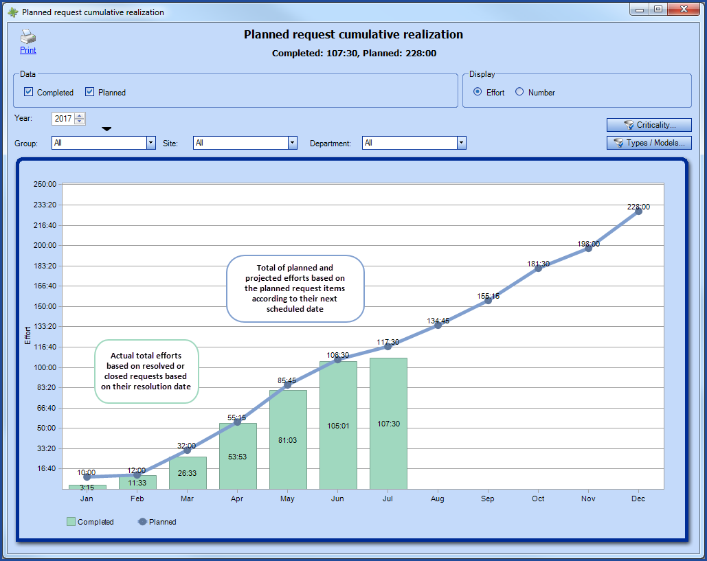
Being able to see the difference between what was planned versus what was done is always difficult, but it is essential in planning preventive maintenance.
That is what the new Planned request cumulative realization graph offers. The graph allows comparing what was Planned versus what was Completed. In addition, the graph can be viewed by Effort or by Number of requests.
To find out more about planned requests, see the Planned Request Management article or more precisely the section on the Planned request cumulative realization graph.

Request types by month
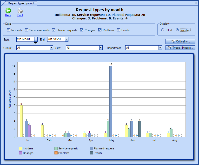
To get an idea of the work accomplished and the time spent working in a given month or period, you need to be able to see what has been done in all request types. The new graph named Request types per month offers a better visibility of the time entered through the activities or the number of completed requests for more efficient resource management.
This report will be very useful for the management of planned requests, but it could just as well be interesting in the Service Desk Management.
For more information on this new report, see the Request types by month section of the Reports and Statistics Module Wiki.

Request types breakdown
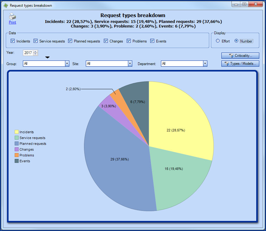
An add-on to the report for Request types per month, we have introduced our newly created pie-chart diagram to represent the repartition of requests per type. In one quick look, you will be able to see where were the efforts made by your ressources, and for which type of requests to better analyze the situation and redistribute the work load more efficiently.
For more information on this new report, see the Request types breakdown section of the Reports and Statistics Module Wiki.

To discover in details all the new features since the last newsletter and more, visit the Release Notes page.
Thank you, your message has been sent.
